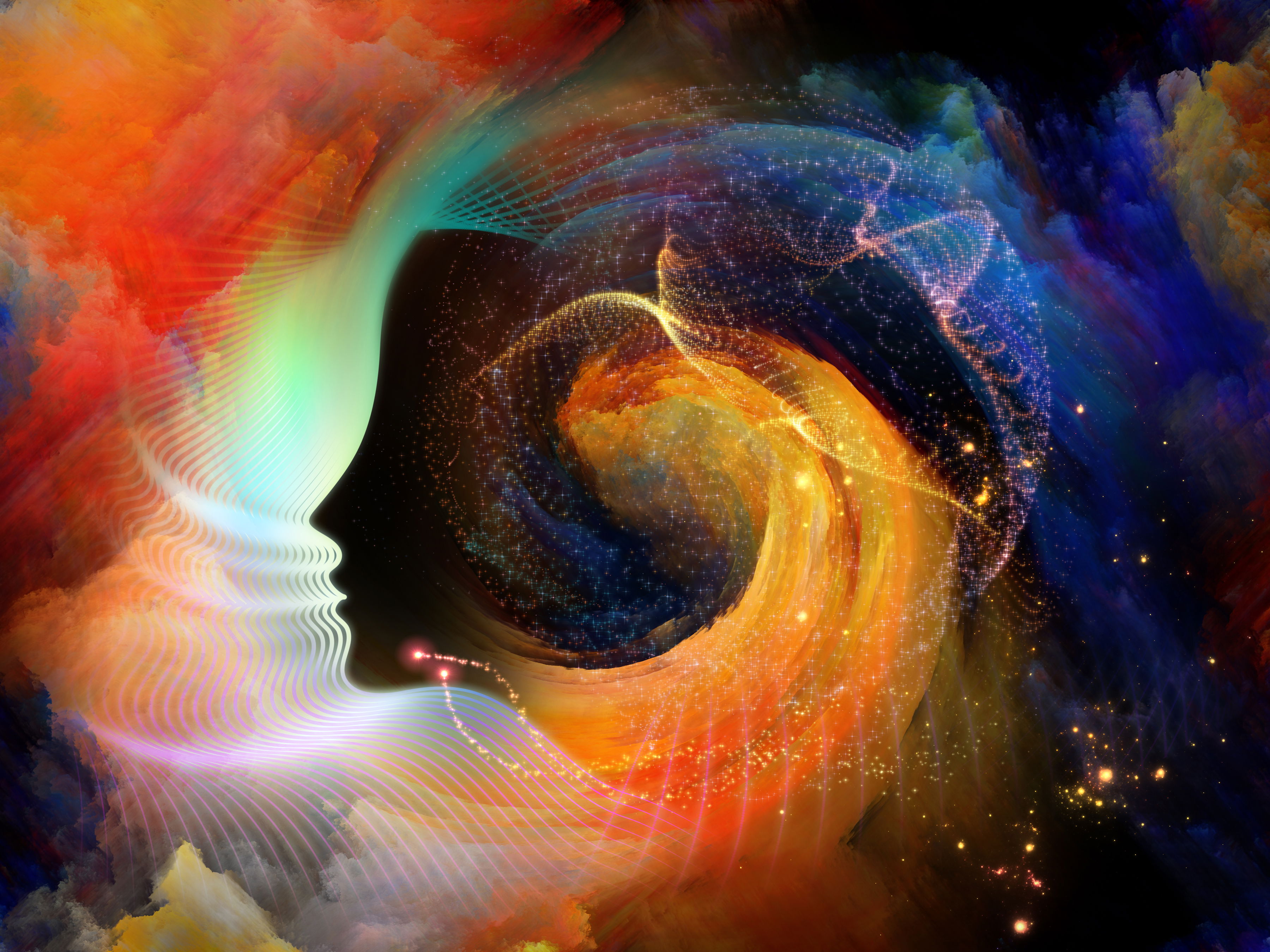
Color Psychology: How Colors Shape Your Emotions, Mood, and Behavior
Colours are more than decoration—they're silent influencers of our inner world. Colour psychology studies how hues affect emotions, behaviour, cognition, and even physiology. From ancient associations (Goethe's 1810 Theory of Colours) to modern fMRI research showing brain activation within milliseconds, evidence confirms colours shape us profoundly.
In 2026, amid global shifts, palettes emphasise emotional utility: grounding neutrals for stability, bold accents for confidence, and Transformative Teal (WGSN/Coloro Colour of the Year) for renewal and resilience. This reflects a collective need for balance—calm foundations with hopeful energy.
While effects vary by culture, context, personality, and experience, patterns are remarkably consistent across studies. A 2025 literature review (analysing 132 studies over 128 years, with 42,000+ participants from 64 countries) found robust links: lighter colours to positive emotions, darker/saturated colours to high arousal/power, and desaturated colours to low arousal/negativity. Warm hues (reds, oranges) arouse; cool hues (blues, greens) soothe.
These responses stem from biology (wavelengths triggering arousal), evolution (red signalling danger/blood), and learnt associations (blue sky = calm). Language reinforces "seeing red" for anger and "feeling blue" for sadness.
Core Principles of Color Psychology
Colours influence through:
- Physiological responses — heart rate, blood pressure, brain activity.
- Emotional associations — valence (positive/negative), arousal (high/low), and dominance.
- Contextual meaning — red on a rose = love; red flag = warning.
- Cultural layers — Universal patterns with local twists.
Warm colours advance (feel closer, energising); cool colours recede (calming, spacious).
Red: Passion, Energy, and Alertness
Red, the longest wavelength, commands attention and spikes arousal—raising heart rate, blood pressure, and excitement. It links to high-arousal emotions: love/passion (positive) and anger/danger (negative).
Studies show red boosts attractiveness in romantic contexts but signals failure in competence tasks. fMRI reveals amygdala activation for fast emotional processing.
Real-life examples:
- Fashion/dating — Red outfits increase perceived appeal.
- Marketing — Fast-food logos (red stimulates appetite/urgency).
- Interiors — Red accents energise gyms; avoid bedrooms (overstimulating).
- 2026 trends — Coral red and heritage reds add confident pops to neutrals.
Overuse risks anxiety—balance with cool.
Blue: Calm, Trust, and Focus
Blue lowers arousal, promoting relaxation and mental clarity. It activates attention areas while soothing the nervous system—ideal for productivity.
Universally tied to positive low-arousal emotions: trust, peace, and relief. "Feeling blue" is cultural sadness, but blue leans calming.
Examples:
- Workspaces — Blue offices enhance detailed tasks.
- Healthcare — Soft blues reduce anxiety.
- Branding — Tech companies use blue for reliability.
- 2026—icy patina blues and deep cobalt for sophisticated calm; pairs with teal.
Excess can feel cold—warm accents help.
Green: Balance, Renewal, and Healing
Green, nature-linked, reduces stress and fosters harmony. Exposure lowers cortisol and boosts creativity/wellbeing.
Associated with contentment, growth, hope—restorative.
Examples:
- Biophilic design — Green walls/plants cut office stress.
- Hospitals — Green promotes healing.
- 2026 — jade, emerald, and sage for sustainability; eucalyptus for wellness.
- Flag symbolism (Dhaka/Bangladesh) — Green for lush hope/prosperity.
Green combats digital fatigue restoratively.
Yellow: Joy, Optimism, and Stimulation
Yellow stimulates serotonin—evoking happiness, focus, and energy. High-arousal positive, but excess causes anxiety.
Examples:
- Classrooms — soft yellow boosts positivity.
- Marketing — Cheerful brands (McDonald's).
- 2026 — Banana yellow or sunwashed soft for uplifting accents.
Bright yellow energises; muted softens.
Teal & Blue-Greens: Renewal and Emotional Clarity (2026 Spotlight)
Transformative teal fuses blue's calm with green's growth—mysterious, regenerative. Symbolises redirection, resilience, and Earth-first optimism.
Psychology: Soothes while inspiring intuition/adaptability. Lowers stress, fosters clarity. 2026 applications:
- Interiors — Moody teal walls for restorative spaces.
- Fashion — Teal coats/suits for confident elegance.
- Wellness — Teal for eco-conscious branding.
Supporting: Jade (sophisticated mystery), icy blues (serenity), chartreuse (energy).
Other Key Colors
- Orange — Enthusiasm, social energy; great for creative spaces.
- Purple — creativity, luxury; deep purples are sophisticated.
- Pink — nurturing, soothing (soft pinks reduce aggression).
- Black — Power, mystery; often negative (sadness).
- White — purity, clarity; can feel sterile.
- Neutrals (2026 warm taupes/khakis) — Grounding stability.
Lightness/saturation matter: lighter = positive; saturated = arousing.
Real-Life Applications in 2026
Interiors — Use teal/greens for calm bedrooms; reds for energising accents; neutrals as bases.
Fashion — Teal for serene confidence; red for bold statements.
Workplaces — Blues/greens for focus; avoid over-red.
Mental Health — Chromotherapy-inspired choices (blue for anxiety relief); mindful palettes aid wellbeing.
Limitations and Individual Differences
Effects are subtle/short-term and influenced by context/culture/personality. Associations are consistent but not magical.
In Dhaka (with green hope and red vitality), teal bridges cultural renewal.
Embracing Color Psychology in 2026
Colours empower intentional living. 2026's mood-driven palettes—transformative teal, warm neutrals, and vibrant accents—prioritise emotional balance. Experiment: notice shifts from a teal wall or red scarf.
Colour psychology reminds us: surroundings shape inner worlds. Choose hues that nurture, energise, and connect.