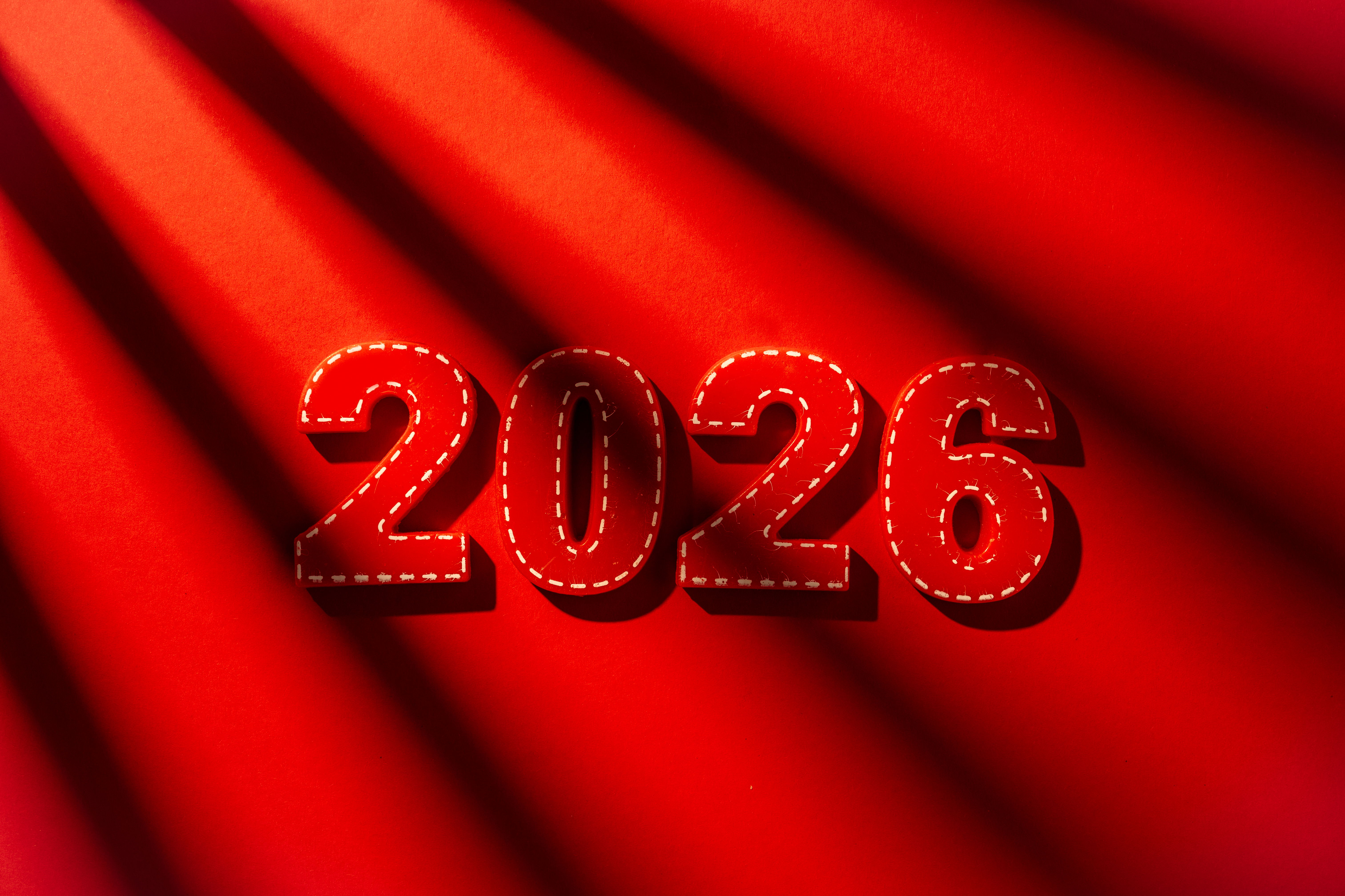
Why 2026 is the Year of Bold Reds & Earthy Neutrals
In 2026, the worlds of fashion, interior design, and even broader visual culture are converging on a striking yet harmonious palette: bold reds meeting earthy neutrals. This isn't just another fleeting trend—it's a response to the times we live in. After years of oscillating between minimalist greys, dopamine-fuelled brights, and ethereal whites (like Pantone's 2026 Colour of the Year, Cloud Dancer, a serene off-white symbolising calm reflection), society craves something more substantial. We want colours that energise without overwhelming us and ground us while allowing self-expression.
Bold reds—think rich burgundies, oxbloods, deep cherry tones, and warm clay-infused crimsons—represent confidence, passion, and a return to vitality. Earthy neutrals—warm taupes, chocolate browns, umbers, khakis, and terracotta-tinged beiges—offer stability, comfort, and a connection to the natural world. Together, they create spaces and wardrobes that feel both daring and reassuring, luxurious yet approachable.
This combination dominates because it perfectly balances the emotional needs of a post-pandemic, fast-paced era. People seek homes and personal styles that feel like sanctuaries (hence the earthy grounding) while injecting personality and boldness (the reds). Designers and forecasters from WGSN, Coloro, and major paint brands like Sherwin-Williams, Benjamin Moore, and others have echoed this through their 2026 forecasts.
The Rise of Bold Reds: Confidence in a Subdued World
Red has always carried symbolic weight—power, energy, love, and even warning. In 2026, red has evolved into a more mature and sophisticated hue, replacing the fiery red of previous decades. Think "mellow reds", "rich plums", "burgundy", "oxblood", and "warm clay reds".
Experts highlight reds as a way to embrace bravery. As one designer noted, 2026 sees "more bravery with colour overall: fewer 'safe' choices, more personality." Reds anchor spaces with visual weight, adding drama without chaos. In interiors, deep reds like Sommelier by Sherwin-Williams or Divine Damson from Graham & Brown create intimate, elegant backdrops. They pair beautifully with natural materials—wood, leather, and velvet—for a luxurious feel.
In fashion, runway shows for Spring/Summer 2026 featured pillar-box reds, poppy reds, and head-to-toe crimson looks from houses like Valentino, Prada, and Alaïa. These bold applications signal empowerment, especially as society moves toward self-expression after periods of restraint.
Why bold reds now? Psychologically, red stimulates energy and appetite, countering the fatigue from neutral-heavy years. Culturally, amid global uncertainties, red evokes resilience and passion. It's a "mood lifter" when paired thoughtfully, but in earthy iterations, it avoids aggression.
Earthy Neutrals: The New Foundation of Comfort
While bold reds provide the spark, earthy neutrals are the canvas. Gone are the cool, sterile greys of the millennial era. 2026 neutrals are warm, textured, and nature-inspired: umber, cocoa powder, universal khaki, broccoli brown, and reddened earth tones.
Sherwin-Williams chose Universal Khaki as its 2026 Colour of the Year—a sandy, warm neutral that feels "tailored and timeless". Benjamin Moore's Silhouette AF-655 blends burnt umber with charcoal for refined elegance. These shades evoke soil, clay, and sunbaked landscapes, promoting wellbeing and sustainability.
Designers describe earthy neutrals as "warm hugs" that anchor spaces. They create cocoon-like environments, restorative amid chaos. In a world craving connection to nature, these tones blur indoor-outdoor lines, pairing with wood, stone, and organic textures.
This shift stems from a desire for authenticity. After "sad beige" fatigue and bright maximalism, people want neutrals with personality—layered, moody, and lived-in. Earthy tones support bold accents like reds without competing, fostering harmony.

Why This Duo Dominates 2026: Cultural and Psychological Drivers
Several factors converge to make 2026 the year of bold reds and earthy neutrals.
First, post-pandemic introspection. Pantone's Cloud Dancer white signals a need for calm, but many crave more warmth. Earthy neutrals provide that serenity with depth, while reds add vitality—preventing spaces from feeling flat.
Secondly, it emphasises the connection to sustainability and nature. Earthy palettes draw from the environment—terracotta, umber, sage—aligning with eco-conscious values. Reds in clay or rust tones feel organic, not synthetic. Third, emotional utility. Colours now serve feelings: grounding (neutrals) and energising (reds). This duality supports wellbeing—calm foundations with expressive pops.
Fourth, trend evolution. From 2025's mocha and peach fuzz to 2026's deeper tones, there's progression toward richness. Forecasts from Emily Henderson, Vogue, and others highlight reds and browns/umbers persisting and intensifying.
In interiors, this means accent walls in burgundy with khaki surrounds or red velvet furniture on brown wood floors. In fashion, crimson coats over taupe outfits or burgundy accessories with neutral bases.
How to Incorporate Bold Reds & Earthy Neutrals
In Interiors
- Use earthy neutrals on walls (e.g., Universal Khaki) for timeless backdrops.
- Add bold reds via accents—cushions, rugs, or a feature wall in oxblood.
- Layer textures: linen, wool, and leather in neutrals; velvet or silk in reds.
- Pair with natural woods, brass, and plants for cohesion.
In Fashion
- Build outfits around earthy neutrals (beige trousers, brown jackets) with red statements (scarves, bags, shoes).
- Monochrome reds for impact, grounded by neutral outerwear.
- Use accessories in burgundy to add a subtle boldness to your outfits.
In Everyday Life This palette extends to branding, product design, and art—evoking confidence and calm.
The Lasting Appeal
2026's bold reds and earthy neutrals transcend trends. Reds bring passion and energy; neutrals offer stability and warmth. Together, they create balanced, expressive environments reflecting our need for both excitement and peace.
As we navigate 2026, this palette reminds us that design can heal, inspire, and empower. It's not just colour—it's a mindset: bold yet grounded, vibrant yet serene.