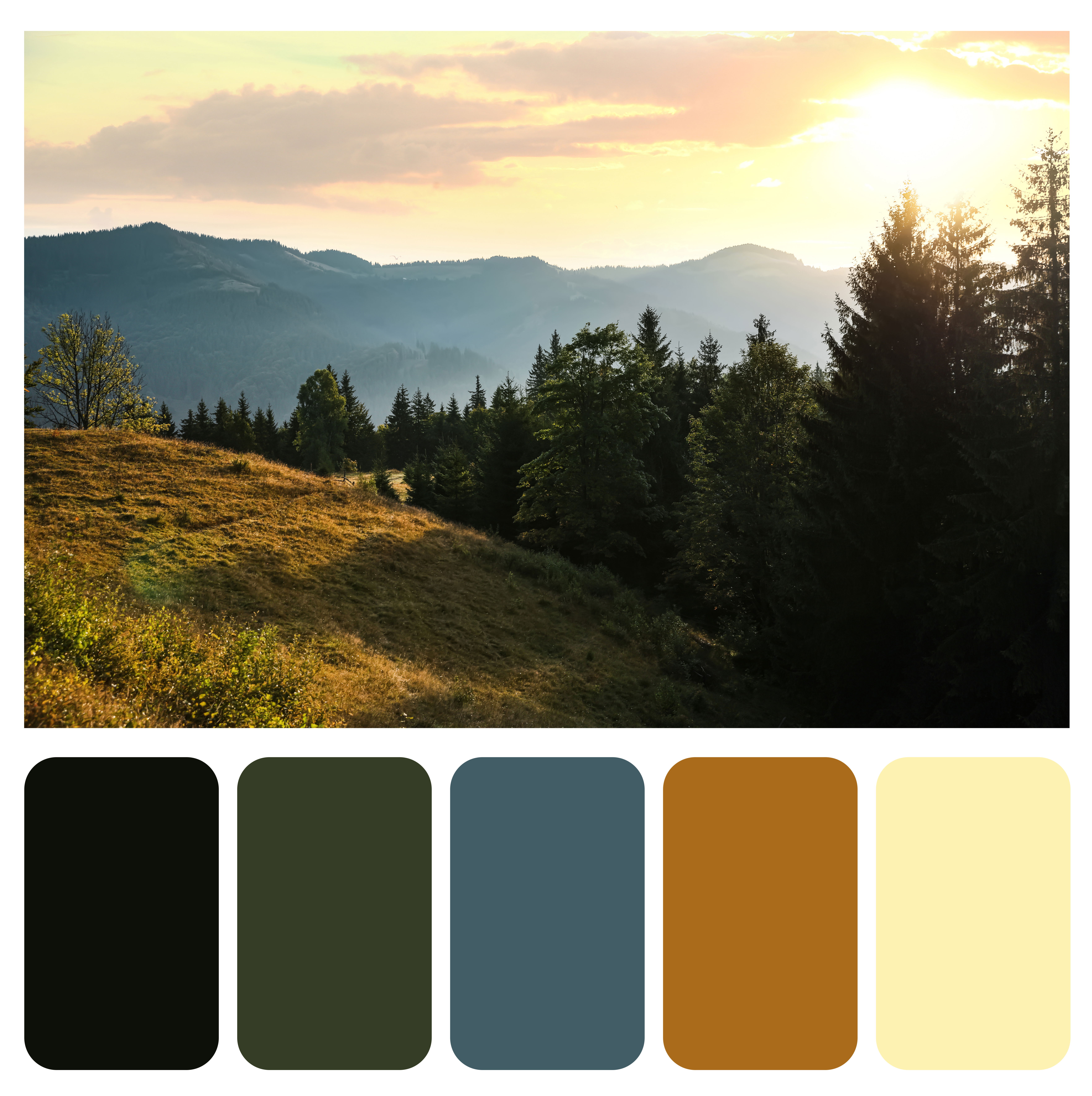
Sustainable Nature Colors: Embracing Earth-Inspired Palettes in 2026
As we navigate 2026, design has shifted decisively toward sustainable nature colours—palettes drawn directly from the earth, forests, oceans, and landscapes. These aren't just aesthetic choices; they're a response to global challenges like climate awareness, urban disconnection from nature, and a collective yearning for grounding amid rapid change. Trends from WGSN, Coloro, Sherwin-Williams, Behr, Pantone, and others converge on hues that feel honest, restorative, and planet-positive.
Key drivers include biophilic design (integrating nature for human wellbeing), essentialism (prioritising timeless, functional beauty), and eco-accountability (favouring bio-based inspiration). Colours evoke natural materials—mushrooms, cacao, forest floors, clay, and moss—promoting emotional resilience, calm, and regeneration. In Dhaka and globally, these palettes align with cultural ties to nature (lush greens for hope, earthy reds for vitality) while supporting sustainable living.
Why Sustainable Nature Colors Define 2026
The shift stems from post-pandemic introspection and environmental urgency. WGSN's Transformative Teal (092-37-14) as Colour of the Year embodies redirection: a fluid blue-green fusion reflecting nature's diversity and an "Earth-first" mindset. It connects to sustainable practices—ancient dyes and bio-based fibres like silk/casein—inspiring healing and resourcefulness.
Sherwin-Williams' Universal Khaki (a midtone, sun-warmed neutral) honours "bare essentials": timeless functionality, nature-inspired warmth, and material integrity. It feels inherently sustainable—evoking recycled finishes, biodegradable mycelium, and organic sensibility.
Other forecasts echo this:
- Behr's Hidden Gem (smoky jade) for mysterious, soothing depth.
- Valspar's Warm Eucalyptus and Dunn-Edwards' Midnight Garden (soft olive greens) for elevated woodsy sustainability.
- Glidden's Warm Mahogany and earthy reds for grounded cosiness.
- Pinterest's palette: Jade, Wasabi (vibrant greens), Cool Blue, and Persimmon (warm earths).
These prioritise biophilic principles: reducing stress, boosting creativity, and blurring indoor-outdoor boundaries. Nature-inspired tones lower cortisol, enhance focus, and foster connection—vital in urban Dhaka or worldwide.
Core Sustainable Nature Color Families in 2026
1. Earthy Neutrals: The Grounding Foundation – Warm taupes, khakis, beiges, sands, and umbers replace cool greys. Sherwin-Williams' Universal Khaki leads—versatile, layered, and "honest". These evoke sunbaked soil, sandstone, and raw organics, promoting stability and essentialism.
Applications: Walls in cosy taupes, paired with natural wood for timeless elegance. In Dhaka, they complement traditional terracotta influences.
2. Muted & Botanical Greens: Renewal and Healing. Soft olives, sages, mosses, eucalyptus, jade, and smoky greens dominate. Behr's Hidden Gem and Valspar's Warm eucalyptus symbolises sustainability and beauty—bringing the outside in.
Psychology: Greens restore balance, reduce anxiety, and evoke growth/hope. Biophilic offices use mossy tones for wellbeing.
2026 examples: muted green kitchens, sage bedrooms, and jade accents for biophilic luxury.
3. Transformative Teal & Aquatic Blues: Regeneration and Clarity. WGSN/Coloro's Transformative Teal fuses deep blue stability with aquatic green vitality—calming, restorative, and forward-thinking. It represents resilience amid climate challenges.
Supporting: icy patina blues, ocean-inspired aquas. Pinterest's Cool Blue adds a serene lift. These promote emotional clarity, intuition, and eco-responsibility—ideal for wellness spaces.
4. Warm Earth Tones: Terracotta, Clay, and Rust Terracottas, clays, caramels, walnuts, and red-browns (warm mahogany) add cosy vibrancy. The "earthy vibrancy" trend features saturated naturals—ochres and rusts—for energy without chaos.
These ground spaces evoke heritage and pair with woods for modern craftsmanship.
5. Supporting Accents: Subtle Pops from Nature Wasabi/chartreuse for botanical energy; persimmon for sun-warmed warmth; soft purples/gentle yellows for balance.

Psychology and Benefits of Sustainable Nature Colors
These hues deliver emotional utility:
- Calm & Restoration — Muted greens/teals lower arousal and reduce stress.
- Grounding & Resilience — Earthy neutrals/terracottas foster stability and authenticity.
- Renewal & Hope — Greens symbolise growth; teal redirection.
- Biophilic Wellbeing — Nature connection improves mood, creativity, and health.
In 2026, they support "sophisticated sustainable living"—intentional, healing spaces.
Real-Life Applications
Interiors
- Walls in universal khaki or muted greens; teal accents for drama.
- Kitchens: Teal-green islands, terracotta tiles.
- Bedrooms: Sage/eucalyptus for sleep, layered with naturals.
Fashion & Lifestyle
- Sustainable fabrics in sage, angora neutrals, and cocoa.
- Teal outerwear; earthy accessories for eco-conscious style.
Branding & Workspaces
- Bio-inspired palettes for offices: moss greens and ocean blues for productivity/wellbeing.
Dhaka Context Aligns with green flag hope and natural abundance—a modern twist on heritage.
How to Incorporate Sustainable Nature Colors
- Start with neutrals (60%) as a base.
- Add greens/teals (30%) for renewal.
- Pops of terracotta/warm earths (10%) for energy.
- Use natural materials: wood, clay, and linen.
- Test in lighting; pair with biophilic elements (plants).
Tools: Coolors/Adobe Colour for palettes; Canva for extraction from nature photos.
The Lasting Impact
Sustainable nature colours transcend trends—they're a mindset. In 2026, they heal, connect us to the planet, and build resilient spaces. From Dhaka's vibrant streets to global designs, these palettes remind us: true beauty is rooted in nature, sustainability, and authenticity.
Embrace them for homes that nurture body, mind, and earth.