Teal & Greens/Blues: The Dominant Palette of 2026
In 2026, the design world has coalesced around a fluid, multifaceted palette: teal, greens, and blues. At its heart stands Transformative Teal—WGSN and Coloro's unanimous Colour of the Year—a deep, mesmerising fusion of dependable dark blue and aquatic green. This isn't a fleeting accent; it's a mindset. Teal bridges blue's serene stability and green's vital renewal, embodying redirection, resilience, and an "Earth-first" ethos in response to climate challenges, polarisation, and the need for restoration.
Complementing teal are supporting shades: smoky jade (Behr's Hidden Gem), emerald and dusty olive, icy patina blues, chartreuse greens, sage, and eucalyptus tones. Pantone's Cloud Dancer (a serene off-white) acts as a luminous counterpoint, allowing these watery hues to breathe. From runways (Alaïa, Saint Laurent, and Loewe featuring rich teal coats) to interiors (moody teal lounges and teal-green kitchens), this palette signals calm confidence amid uncertainty.
Why now? After years of neutrals, bright maximalism, and warm earths, society craves balance—colours that ground while inspiring growth. Teal's versatility (mysterious yet approachable) makes it ideal for transitional times. Psychologically, it soothes the nervous system, fosters intuition, and promotes emotional clarity.
The Rise of Transformative Teal: 2026's Defining Hue
WGSN/Colouro named Transformative Teal (Colouro code 092-37-14) for its symbolic power. A "fluid fusion" of blue and aqua green, it mirrors ocean depths and forest richness—diverse nature in one shade. It represents:
- Change and redirection: challenging old ideas, embracing resilience.
- Restoration and calm: countering global tensions with quiet optimism.
- Earth-first mindset: prioritising ecological awareness and renewal.
Experts describe it as "mysterious and mesmerising", versatile across genders, seasons, and mediums. In fashion, rich teal appears in suiting, coats, and maximalist opulence. In interiors, it anchors spaces with depth—think enigmatic teal lounges or teal-green islands.
This hue evolved from prior forecasts: after Apricot Crush (2024) and Future Dusk (2025), teal signals maturation—less dopamine brights, more sophisticated renewal.
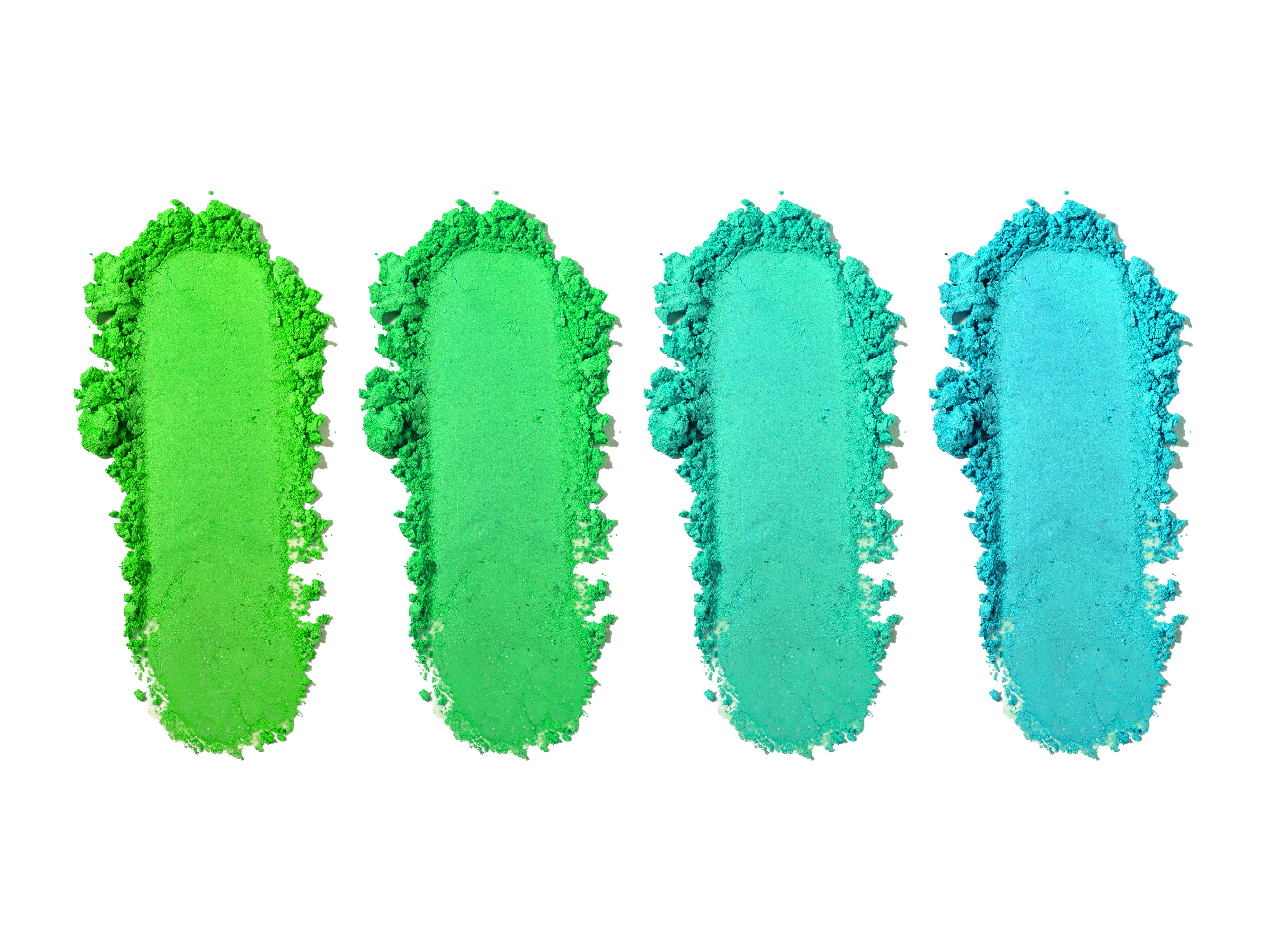
Supporting Shades: Greens and Blues in Harmony
Teal doesn't stand alone; it's amplified by family members.
Greens:
- Jade/Smoky Jade (Behr Hidden Gem): Dusky, sophisticated—mysterious like a geode. Grounds luxury spaces.
- Emerald/Dusty Emerald: Rich jewel tones for depth; pairs with neutrals for timeless elegance.
- Sage/Shale Green (Pantone): Soft, biophilic—promotes healing and sustainability.
- Chartreuse/Mint: Luminous accents for energy without overwhelm.
- Eucalyptus/Olive: Warm, grounded—evoke renewal in wellness-focused designs.
Blues:
- Icy/Patina Blue: Frosty, glacier-inspired—calming, transitional.
- Deep Cobalt/Prussian Blue: Authority and sophistication; moody backdrops.
- Aquatic/Aqueous Blue-Greens: Ocean-inspired fluidity;
These create layered palettes: teal as anchor, greens for growth, blues for serenity. Pantone's palettes (Powdered Pastels, Aquatic mixes) incorporate them with Cloud Dancer for lift.
Color Psychology: Why Teal, Greens, and Blues Resonate
Teal blends blue's tranquillity (trust, focus, lowered arousal) with green's optimism (growth, healing, balance). It evokes:
- Calm restoration: reduces stress; ideal for wellness, spas, and bedrooms.
- Emotional clarity/intuition: Encourages reflection and adaptability.
- Renewal/resilience: Green undertones symbolise rebirth; blue adds stability.
- Connection to nature: Mirrors oceans/forests—promotes biophilic wellbeing.
Studies link blue-greens to lowered cortisol and enhanced creativity. In 2026, amid redirection needs, this palette fosters "quiet resilience"—steady growth without chaos.
Blues alone calm (serenity, productivity); greens heal (balance, hope). Together, they create restorative environments.
Applications in Interiors: Creating Sanctuaries
2026 interiors embrace teal/greens/blues for grounding luxury.
- Walls/Feature Elements: Transformative Teal as moody accent walls or full rooms—shifts with light for drama.
- Kitchens/Baths: Teal-green islands (concrete counters) or backsplashes—fresh, spa-like.
- Living Spaces: Dusty emerald sofas, icy blue accents—layered with naturals (wood, leather).
- Bedrooms: sage or patina blue for sleep; teal velvet headboards for sophistication.
Pair with earthy umbers, terracottas, or Cloud Dancer whites. Textures (velvet, linen) enhance depth.
Examples: teal lounges in social clubs; smoky jade kitchens for natural luxury.
Fashion and Lifestyle: Bold Yet Balanced
Runways showcase teal in coats and suiting (Alaïa, Loewe)—expensive, mysterious. Monochrome teal or paired with chocolate brown/red for impact.
In wellness/branding: Teal for eco-conscious packaging; jade for sustainable fashion. Weddings adopt teal for serene, meaningful palettes.
Cultural and Global Resonance
Teal echoes universal nature symbols—oceans (renewal), forests (growth). In Dhaka/Bangladesh, green (flag, hope) and blue (serenity) align with national vitality; teal bridges them for modern expression.
Globally, it supports sustainability—planet positivity amid challenges.
Pairing and Creating Palettes
- Analogous: teal + jade + mint—serene flow.
- Complementary: teal + warm terracotta/red—dynamic balance.
- Monochromatic: Variations for elegance.
- With neutrals: earthy taupes/umbers ground it.
Tools like Coolors or Adobe Colour generate teal-focused schemes.
Why This Palette Endures Beyond 2026
Teal/greens/blues offer timeless versatility—calm yet transformative. They heal, inspire, and connect us to nature—perfect for uncertain times.
As 2026 unfolds, embrace transformative teal and kin for spaces that nurture resilience and hope.