The Psychology and Science of Warm vs Cool Colors
Walk into a room painted deep red or bright orange, and you might feel energized, hungry, or even a bit warmer. Step into a space dominated by soft blues and greens, and a sense of calm or spaciousness often washes over you.
This intuitive difference between warm and cool colors is one of the most universal aspects of color experience. It influences everything from interior design and branding to art, marketing, and even our daily mood. But what makes some colors feel “warm” and others “cool”? Is it purely psychological, or is there solid science behind it?
Defining Warm and Cool Colors
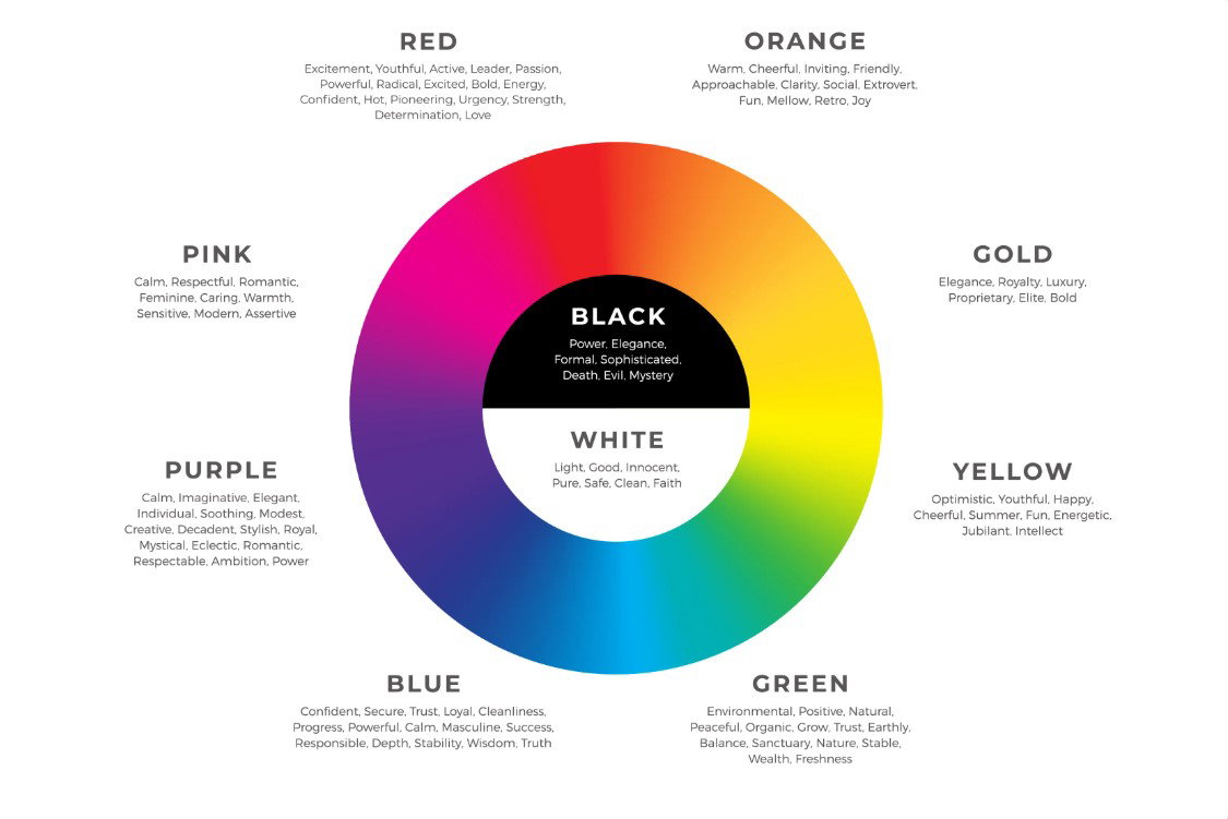
In color theory, warm colors include reds, oranges, and yellows (plus their variations like terracotta or gold). They are associated with fire, sunlight, and sunsets.
Cool colors include blues, greens, and purples (plus teals and lavenders). They evoke water, sky, ice, and shade.
This division isn’t arbitrary. It stems from both natural associations and how our visual system processes light.
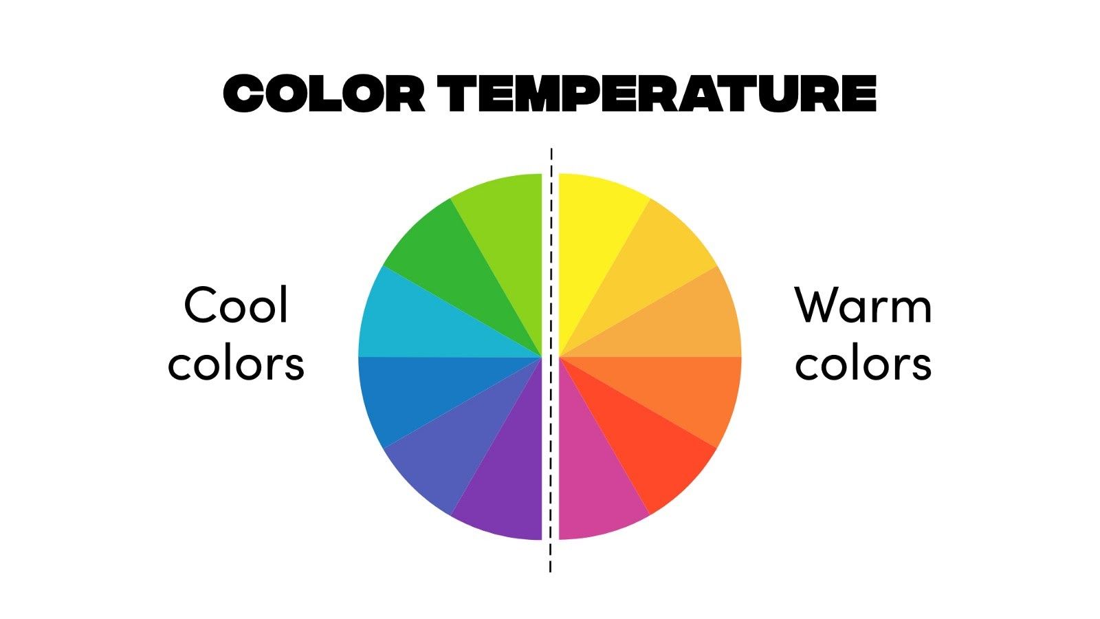
Caption: Classic warm vs. cool color temperature wheel. Warm hues sit on one side of the spectrum, and cool hues on the other.
The Science: Why Colors Feel Warm or Cool
The distinction has roots in physics and biology:
- Wavelength and Light: Longer wavelengths (reds, oranges) carry less energy and are associated with heat sources like fire or incandescent bulbs. Shorter wavelengths (blues) are linked to cooler daylight or shaded environments.
- Color Temperature in Lighting: Measured in Kelvin (K). Warm light (~2700–3000K) has a yellowish glow; cool light (~5000–6500K) appears bluish-white. Our brains link these to real-world thermal experiences.
- Perceptual Mechanisms: Recent research shows the warm-cool dimension aligns with perceived saturation in CIELAB space and may reflect adaptations to natural scene statistics (e.g., orangish-red to greenish-blue axis). Warm colors often advance spatially (appearing closer), while cool colors recede, creating depth illusions.
Research indicates that warm colors are associated with heightened physiological arousal, resulting in elevated heart rate, blood pressure, and metabolism in certain instances, whereas cool colors generally facilitate relaxation and diminish arousal.
The Psychology: How Warm and Cool Colors Affect Mood and Behavior
Warm and cool colors influence emotions, cognition, and even performance in consistent ways across cultures, though individual and contextual differences exist.
Warm Colors (Red, Orange, Yellow):
- Energizing and Stimulating: They grab attention, increase alertness, and can boost excitement or appetite. Red is linked to passion, urgency, and power—but also anger or danger in excess.
- Positive Associations: Happiness, warmth, comfort, optimism, creativity.
- Potential Downsides: Overstimulation, anxiety, or aggression if overused.
- Applications: Restaurants (to encourage eating), call-to-action buttons, energetic branding, or cozy living spaces.
Cool Colors (Blue, Green, Purple):
- Calming and Soothing: Blue promotes trust, security, and focus; green evokes nature, balance, and refreshment; purple suggests creativity and luxury.
- Positive Associations: Peace, tranquility, professionalism, clarity, relaxation.
- Potential Downsides: Can feel cold, distant, or sad if too dominant or desaturated.
- Applications: Offices or bedrooms for productivity and rest, healthcare settings for calm, tech brands for trust.
Research shows mixed but insightful results:
- Cool colors often improve accuracy and reduce negative affect in certain lighting combinations.
- Warm colors can heighten arousal but may increase errors in high-concentration tasks.
- Interactions matter: Warm lighting with cool walls (or vice versa) sometimes yields better mood outcomes than matching temperatures.

Caption: Classic warm color palette — reds, oranges, and yellows that feel energetic and inviting.

Caption: Cool color palette — blues, greens, and purples that evoke calm and serenity.
Caption: Emotional associations mapped to colors. Warm tones often link to high-arousal states; cool tones to calmer, reflective ones.
Practical Applications and Tips
- Interior Design: Use warm accents in social or dining areas; cool tones in bedrooms or workspaces for focus.
- Branding & Marketing: Warm colors for food, urgency, or fun; cool for trust, health, or technology.
- Art & Photography: Warm colors advance elements; cool colors create depth and background.
- Balance is Key: Most effective designs combine both—warm for energy, cool for rest. Consider lighting: warm light enhances cozy feelings; cool light boosts alertness.
- Context Matters: Cultural differences, personal experiences, and saturation/brightness can modify effects. Always test in real environments.
Final Thoughts
The warm-vs-cool divide is both a hardwired perceptual phenomenon and a powerful psychological tool. Rooted in our evolutionary experiences with fire and water, sunlight and shade, it continues to shape how we feel, behave, and design our world.
Understanding this science lets us move beyond intuition to intentional choices—creating spaces and visuals that not only look appealing but also genuinely influence mood and perception for the better.
Whether you’re painting a room, designing a logo, or choosing an outfit, remember: color temperature isn’t just about aesthetics. It’s about how your brain interprets the world around you.