Color Temperature and CRI: Choosing the Right Light for Accuracy
Walk into a room and the light feels either cozy and warm or bright and clinical. Pick up a paint swatch or examine a piece of artwork, and the colors either pop vividly or look dull and off.
These differences aren’t random — they’re controlled by two key lighting specifications: Color Temperature and CRI (Color Rendering Index). Understanding both helps you choose lights that deliver accurate, pleasing, and consistent color for your home, workspace, art, photography, or retail space.
What Is Color Temperature?
Color temperature describes the appearance (warmth or coolness) of white light, measured in Kelvin (K).
It’s based on the concept of a theoretical “black body” radiator heated until it glows. Lower temperatures produce warmer (yellow-orange) light; higher temperatures produce cooler (bluish) light.
Common ranges:
- 2000K–3000K: Warm white (incandescent-like, cozy, yellowish). Ideal for living rooms, bedrooms, and restaurants—creates a relaxing, inviting mood.
- 3000K–4000K: Neutral warm white. Good balance for general home use.
- 4000K–5000K: Cool white / bright white. Energetic and clear. Great for offices, kitchens, bathrooms, and task lighting.
- 5000K–6500K: Daylight / cool daylight. Closest to natural midday sun. Best for accurate color work, art studios, retail displays, and areas needing focus and vibrancy.
Higher Kelvin = cooler, bluer light. Lower Kelvin = warmer, more amber light.
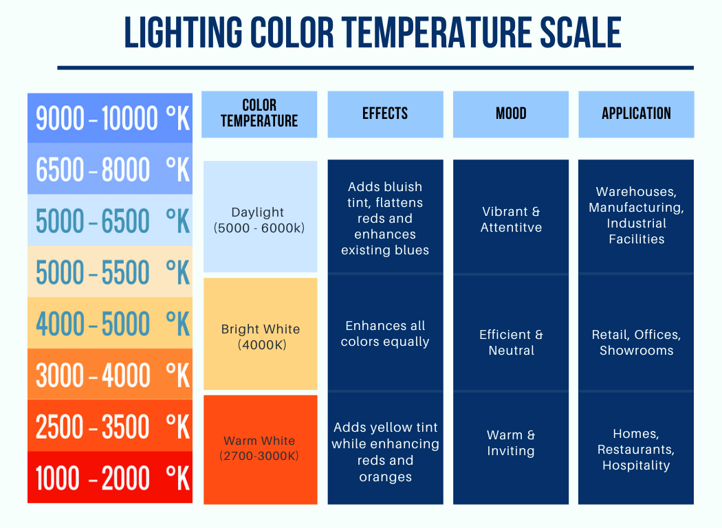
Caption: Color temperature scale in Kelvin with typical applications and mood effects.
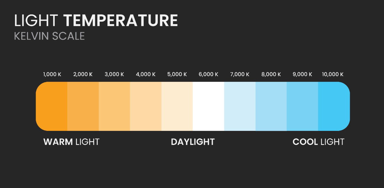
Caption: Simple Kelvin scale showing the shift from warm orange tones to cool blue daylight.
What Is CRI (Color Rendering Index)?
While color temperature tells you how the light looks, CRI tells you how accurately it reveals the true colors of objects.
CRI is a scale from 0 to 100 that compares how colors appear under a test light source versus a reference source (usually daylight or a black-body radiator like an incandescent bulb).
- CRI 100: Perfect color rendering — colors look exactly as they would under ideal natural light.
- CRI 90–100: Excellent. Highly recommended for art, photography, design, retail, and anywhere color accuracy matters.
- CRI 80–89: Good for most residential and general commercial use.
- CRI below 80: Often poor. Colors can appear washed out, muted, or shifted (especially reds and skin tones).
High-CRI lights make reds richer, greens more vibrant, and skin tones more natural. Low-CRI lights can make everything look dull or strangely tinted.
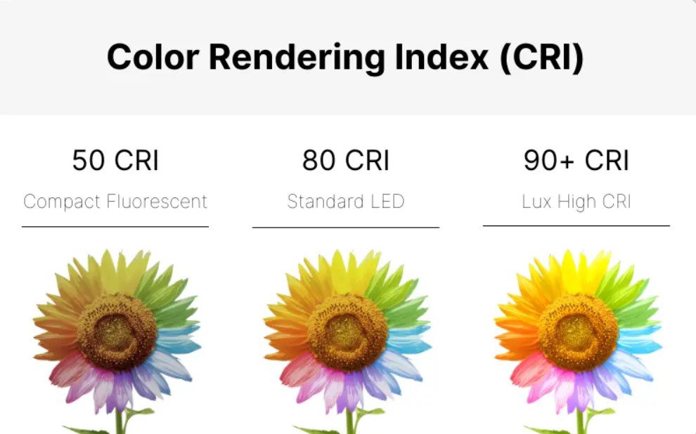
Caption: Strawberries under different CRI levels. Notice how vibrant and true the colors appear at 80–90+ CRI compared to lower scores.
Caption: Flower under varying CRI — higher CRI preserves saturation and natural hues.
Color Temperature vs. CRI: They Work Together
These two metrics are independent but equally important:
- You can have warm light (2700K) with high CRI (excellent color accuracy) or poor CRI (dull colors).
- You can have cool daylight (6500K) with high or low CRI.
Best practice: Choose the right temperature for the mood and task, then prioritize high CRI (90+) for accuracy.
Practical Recommendations by Use Case
- Home / Living Areas: 2700K–3000K with CRI 90+ for cozy, flattering light.
- Kitchen / Bathroom / Office: 3500K–5000K with CRI 90+ for clarity and energy.
- Art Studios, Photography, Design: 5000K–5500K with CRI 95+ for the most accurate color rendering.
- Retail / Fashion / Makeup: 4000K–5000K with CRI 90+ to make products look their best.
- Hospitals / Medical: High CRI (90+) at neutral to cool temperatures for accurate skin and tissue assessment.
Quick Tips for Choosing Lights
- Always check both Kelvin (K) and CRI on the product specs.
- For critical color work, look for R9 values (red rendering)—many high-CRI lights specify these values separately because red is often the weakest color in LEDs.
- Test lights in real conditions if possible — a light booth with multiple illuminants is ideal for professionals.
- Modern LEDs now offer excellent CRI (95+) at various temperatures, making high-quality lighting more accessible and energy-efficient than ever.
Understanding color temperature and CRI empowers you to create spaces where colors look natural, vibrant, and true—whether you’re relaxing at home, working precisely, or showcasing products.
The right light doesn’t just illuminate — it reveals.