Color Science Tools Every Designer and Photographer Should Know
Accurate color is the difference between a good result and a professional one. A beautiful edit on your screen can look entirely different when printed or viewed on another device.
The good news? A handful of essential color science tools can give you consistent, predictable, and client-ready colors from capture to final output. Here’s the practical toolkit every serious designer and photographer should know.
1. Monitor Calibration Hardware (The Foundation)
Your monitor is the window through which you judge every color. Without calibration, you’re working blind.
Must-have tools:
- X-Rite i1Display Pro (or i1Display Studio) — The industry standard for accuracy and speed.
- Datacolor SpyderX Pro/Elite—excellent value with great software and ambient light monitoring.
These devices measure your screen’s color output and create a custom ICC profile so what you see matches real-world standards (D65 white point, 2.2 gamma).
Pro tip: Calibrate every 2–4 weeks, or after major lighting changes in your workspace.
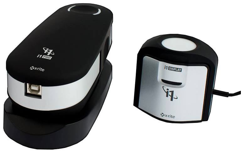
Caption: X-Rite i1Display Pro and i1Pro spectrophotometer — essential hardware for accurate monitor and print color management.
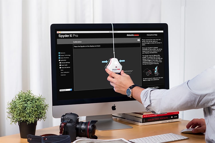
Caption: Datacolor SpyderX Pro in use during monitor calibration.
2. Color Checkers (Reference Standards for Capture)
Color checkers provide known reference patches you can use to correct white balance, exposure, and color in post-production.
Top recommendations:
- X-Rite ColorChecker Classic or Passport Photo—a 24-patch classic or pocket-sized version with a gray scale and color targets.
- Use it during shoots to create custom camera profiles in Lightroom or Capture One.
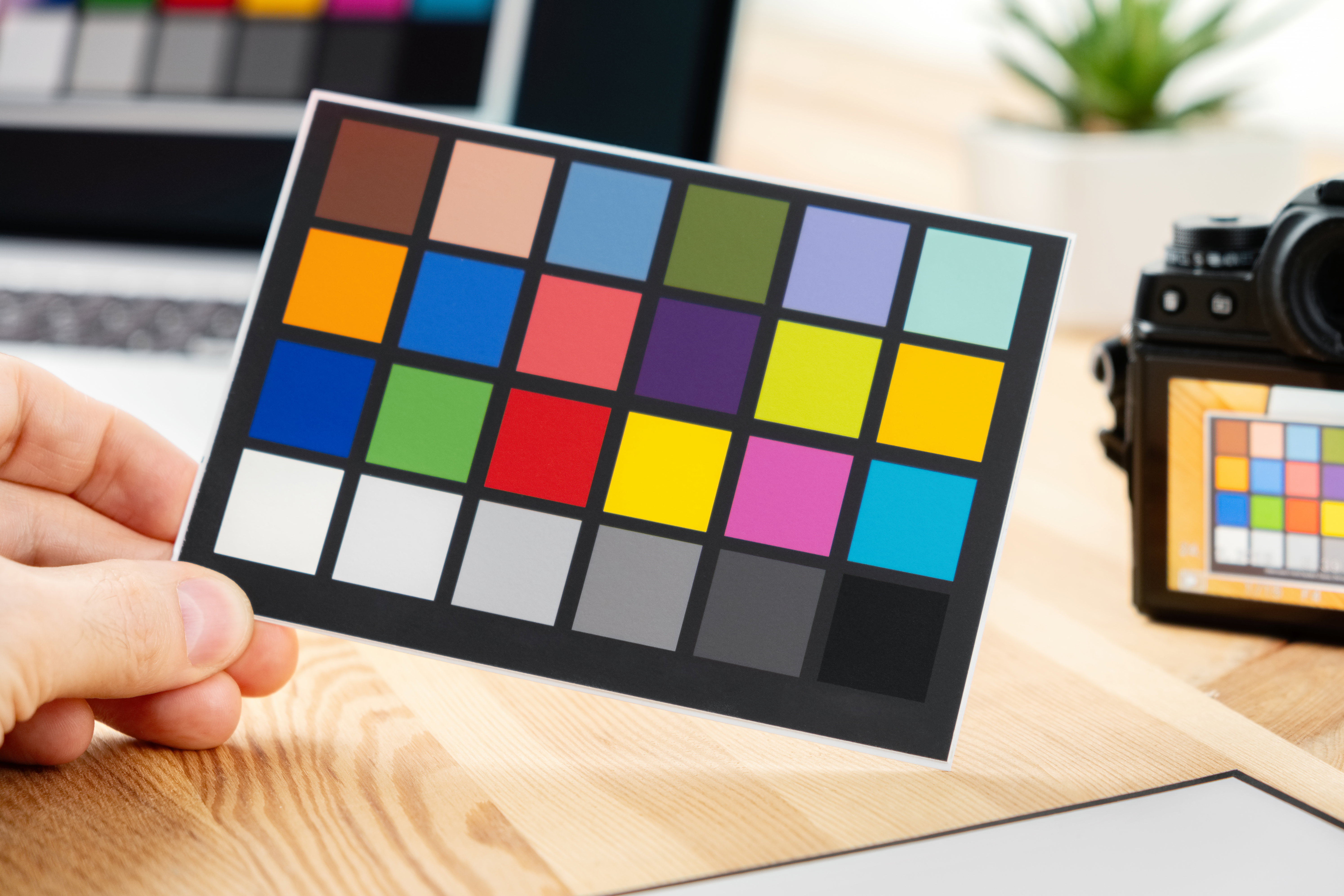
Caption: X-Rite ColorChecker Passport — a must-have reference tool for accurate color in photography.
3. Spectrophotometers (For Precise Measurement)
When you need to measure physical colors (prints, fabrics, paint, products), a spectrophotometer is the gold standard.
- X-Rite i1Pro 2 or i1Pro 3 — Measures spectral data for the most accurate results.
- Handheld models are ideal for matching brand colors or verifying prints.
These tools output reliable Lab* values, allowing you to calculate ΔE (color difference) with precision.
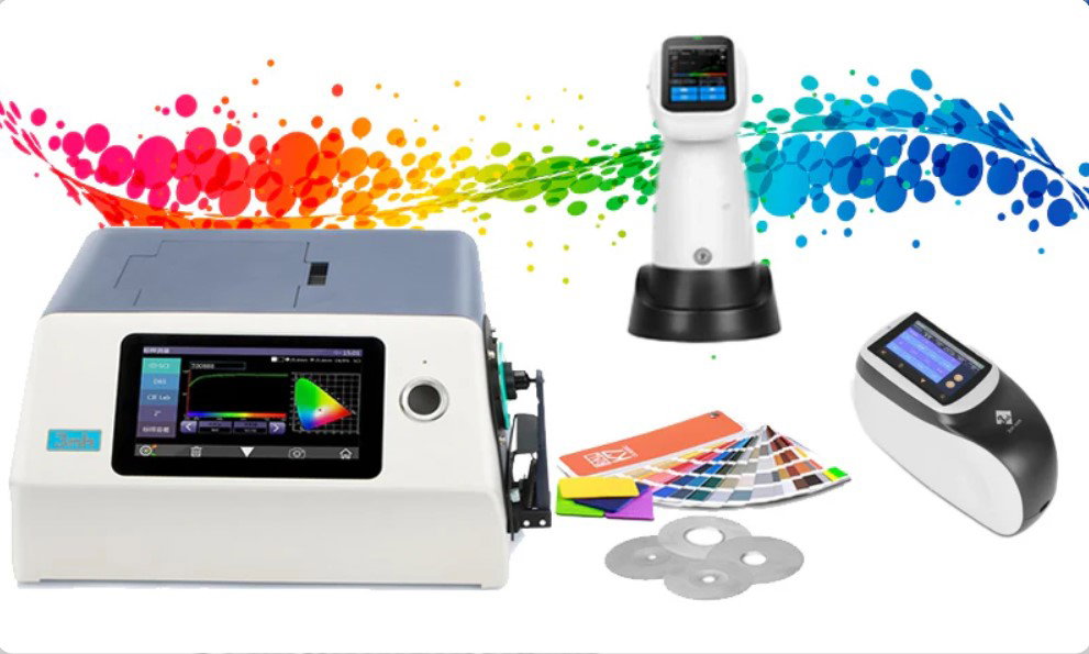
Caption: Professional spectrophotometer used for measuring physical colors in design and manufacturing.
4. Color Management Software
Hardware needs software to unlock its full potential.
Essential tools:
- DisplayCAL (free, powered by ArgyllCMS) — One of the most powerful and accurate calibration packages available.
- X-Rite ColorMunki or i1Profiler software.
- Adobe Creative Cloud tools (color settings, soft proofing in Photoshop/Lightroom).
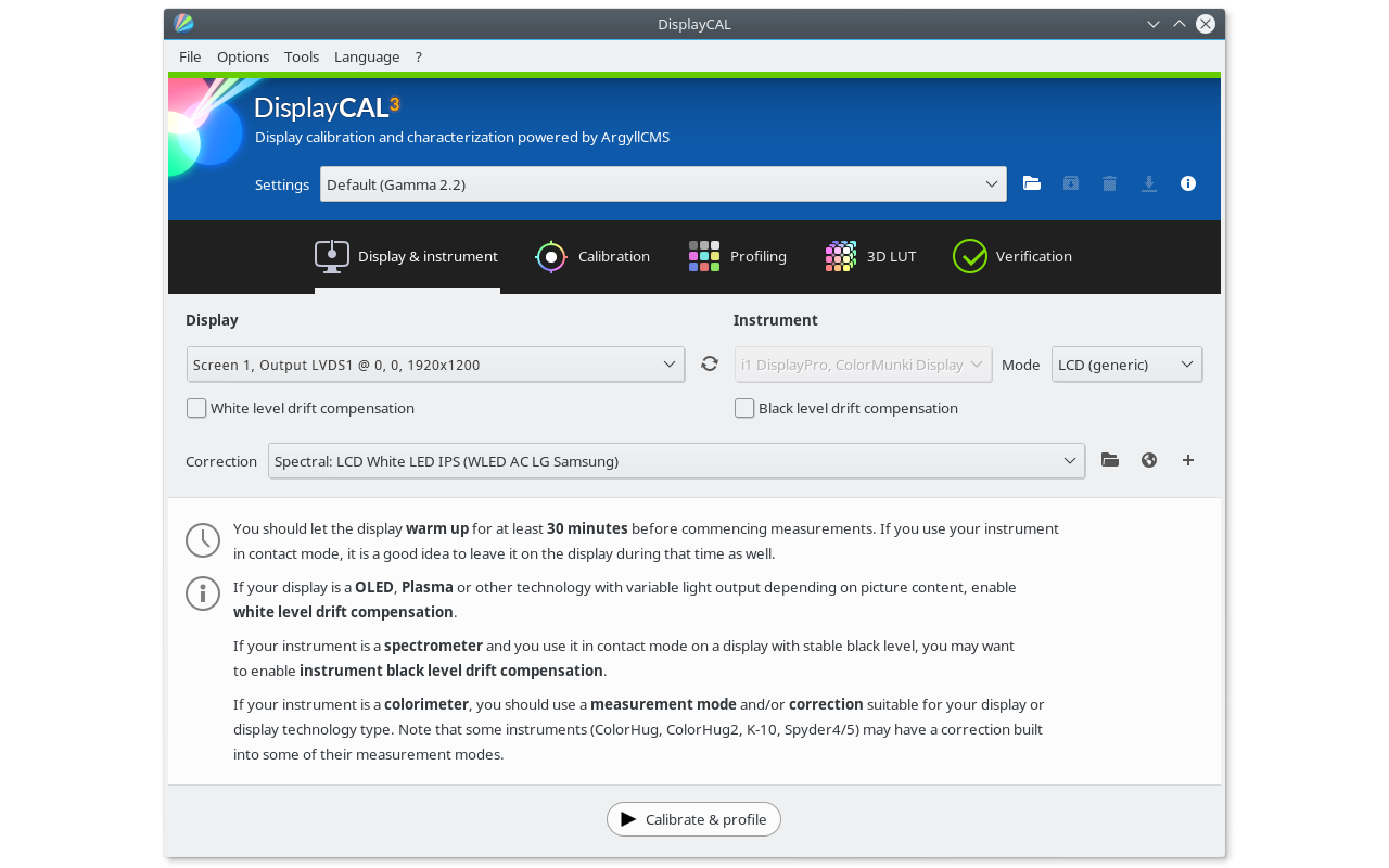
Caption: DisplayCAL interface — a powerful, free tool for professional monitor calibration and profiling.
5. Color Spaces and Analysis Tools (The Science Layer)
- CIELAB (Lab) and LCh*—Use these perceptually uniform spaces for accurate color comparison and matching.
- ΔE calculators (built into most profiling software) — Measure how close two colors really are.
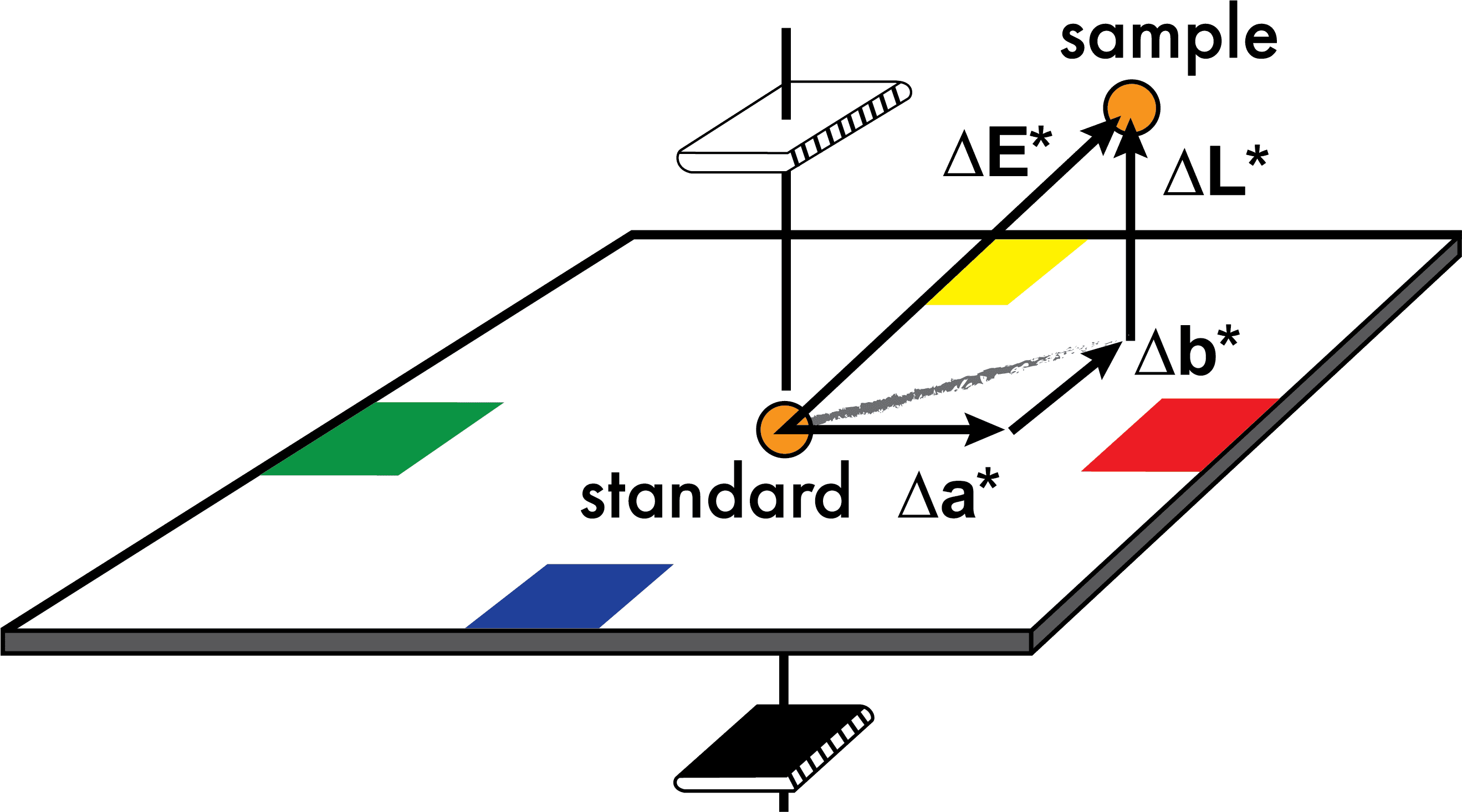
Caption: Understanding ΔE in CIELAB space — the standard way to quantify color differences.
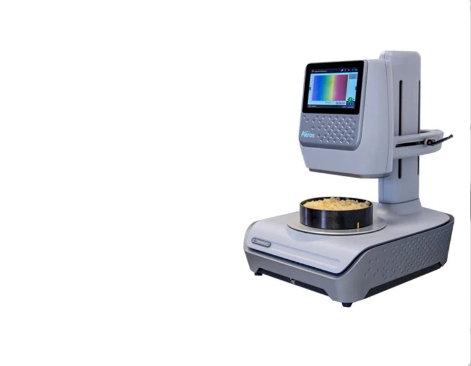
Caption: Advanced spectrophotometer measuring real-world samples for precise color data.
Recommended Workflow for Designers & Photographers
- Calibrate your monitor regularly with i1Display or SpyderX.
- Shoot with a ColorChecker for accurate reference data.
- Edit in a wide-gamut working space (Adobe RGB or ProPhoto RGB).
- Soft proof using the correct output profile before printing or client delivery.
- Measure and verify critical colors with a spectrophotometer and ΔE.
- Use LCh for intuitive fine-tuning of hue, chroma, and lightness.
Bonus Free / Low-Cost Tools
- Adobe Color (online) — Great for exploring color harmonies.
- ColorSync Utility (macOS) or Windows color management tools.
- Online ΔE calculators for quick checks.
Final Thoughts
Mastering these color science tools removes guesswork and replaces it with confidence. Whether you’re matching a brand color across materials, delivering prints that look exactly as intended, or ensuring your photos render beautifully online, the right tools make the difference between “close enough” and “perfect.
”Start with monitor calibration—it's the single highest-impact upgrade you can make today. Then gradually add a ColorChecker and spectrophotometer as your workflow demands grow.
Invest in color accuracy once, and every project that follows will look better, faster, and more professional.