Debunking Color Myths: What Traditional Color Theory Gets Wrong
Traditional color theory—the one many of us learned in school with a simple color wheel, red-yellow-blue primaries, and neat rules about complementary colors—feels comforting and straightforward.
However, modern color science reveals that much of it is oversimplified, outdated, or outright incorrect. These myths persist in art classes, design tutorials, and even some professional workflows, leading to frustration when colors don’t behave as expected.
Let’s bust the biggest ones with facts from physics, biology, and perceptual science.
Myth 1: Red, Yellow, and Blue Are the True Primary Colors
This is perhaps the most stubborn myth. In school, we’re taught that red + yellow = orange, yellow + blue = green, and red + blue = purple—and that these three can mix to create “all colors."
”Reality: Red, yellow, and blue (RYB) are a historical, pigment-based approximation, not true primaries.
- For additive color (light, screens): The primaries are red, green, and blue (RGB). Mixing them produces white.
- For subtractive color (pigments, printing): The modern primaries are cyan, magenta, and yellow (CMY), with black (K) added for depth. CMY can produce a much wider, cleaner gamut than RYB.
Mixing RYB often results in muddy browns instead of clean secondaries because real pigments have impurities and overlapping absorption spectra. True vibrant purples require magenta, not just “red + blue.”
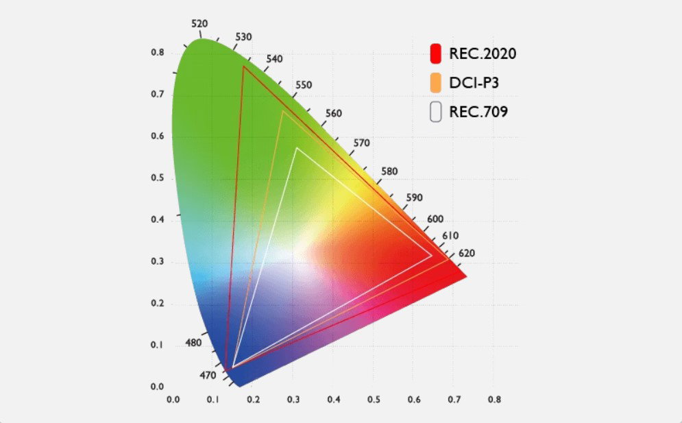
Caption: Gamut comparison on the CIE diagram: Traditional RYB thinking is limited compared to modern RGB (additive) or CMY (subtractive) models.
Myth 2: Complementary Colors Always Mix to Perfect Neutral Gray or Black
Traditional color wheels claim that opposites (red-green, blue-orange, yellow-purple) “cancel” each other out into neutral gray when mixed.
Reality: This process works inconsistently at best.
In subtractive mixing with real paints, red + green often yields a dull olive or brown, not clean gray. Blue + orange can come close in some cases, but results vary wildly depending on the specific pigments.
Modern understanding (via opponent-process theory) explains why our visual system processes color in opposing channels (red-green, blue-yellow, black-white). But physical pigment mixing doesn’t perfectly align with these neural opponencies. Complementary pairs in light (additive) are different from those in pigments.
Myth 3: There Are Exactly Seven Colors in the Rainbow
“ROYGBIV” (red, orange, yellow, green, blue, indigo, violet) is a popular mnemonic.
Reality: The visible spectrum is continuous. Newton chose seven colors partly for mystical reasons (linking to the seven notes in a musical scale). There is no sharp boundary between colors, and “indigo” is barely distinguishable from violet for most people. The spectrum has infinitely many wavelengths; we categorize them for convenience.
Myth 4: Warm and Cool Colors Are Fixed and Universal
We’re told reds/oranges are always “warm” and blues/greens are always “cool.
”Reality: Color temperature is relative and context-dependent.
A yellowish-green can appear warm next to a pure blue but cool next to a fiery orange. Perceived warmth also shifts with lighting, surrounding colors, and even personal factors. While there are general trends rooted in natural associations (sun/fire vs. sky/water), strict warm/cool rules break down in real-world use. Advanced models like CIELAB show that hue, chroma, and lightness interact in complex ways.
Myth 5: Color Is an Objective Property of Objects
Many believe an apple is inherently “red.”
Reality: Color is a perceptual experience created in the brain.
Objects reflect or absorb certain wavelengths of light, but the color we see depends on the following:
- The light source (illuminant)
- Surrounding colors (simultaneous contrast)
- Individual differences in cone cells and brain processing
- Viewing conditions
This is why metamerism occurs (colors match under one light but not another) and why two people can genuinely disagree on a color’s shade.
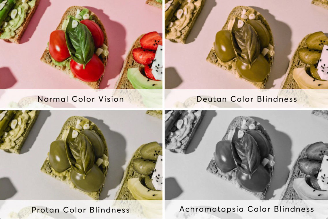
Caption: The same scene can appear strikingly different depending on individual perception, lighting, or color deficiencies.
Myth 6: Magenta (or Purple) Isn’t a "real" Color
Some claim that magenta doesn’t exist in the spectrum, so it is considered “fake.”
Reality: All colors are perceptual constructs. Magenta is a real sensation created when our red and blue cones are strongly stimulated with little green input. It’s as “real” as any other hue—just extra-spectral (not corresponding to a single wavelength).
Why These Myths Persist — and Why They Matter
Traditional color theory was developed before we fully understood trichromatic vision, opponent-process theory, CIE color spaces, and modern colorimetry. It was a useful simplification for artists working with limited pigments centuries ago.
Today, with digital tools, wide-gamut displays, and precise measurement (CIELAB, ΔE, and spectrophotometers), clinging to outdated rules leads to muddy mixes, inconsistent branding, and frustrated clients.
Moving Forward: A More Accurate Approach
- Use RGB for digital screens and CMY(K) for printing.
- Think of CIELAB/ L*Ch for perceptual accuracy and color matching.
- Rely on color management (ICC profiles, calibrated monitors) rather than intuition alone.
- Test colors under real viewing conditions and multiple illuminants.
Understanding the science behind color doesn’t kill creativity — it frees you from myths and lets you make more intentional, reliable choices.
The next time someone tells you “red and green are perfect complements,” you’ll know there’s a more nuanced (and useful) truth waiting in modern color science.