
Explore 25 on-trend, practical color palette ideas for 2026 branding, with tips for usage, contrast, and consistent design systems.
Read MoreColor Theory
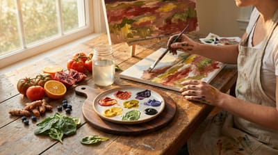
A practical top-25 list of essential color mixing rules, from warm and cool primaries to complements, neutrals, value control, and clean palettes.
Read More
A point by point list of 25 curated color palettes with hex codes, best use cases, and practical tips to apply them in real designs.
Read More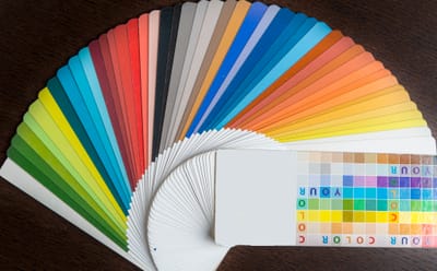
Traditional color theory taught us red-yellow-blue primaries, perfect complementary colors, and fixed warm vs cool rules. Many of these ideas are outdated or simply wrong. Discover the biggest color myths debunked by modern color science — from RGB vs RYB primaries and why complements don’t always make gray to the truth about warm vs cool colors and magenta.
Read More
Master color accuracy with the essential color science tools every designer and photographer needs. From monitor calibration hardware (X-Rite i1Display, Datacolor Spyder) and spectrophotometers to software like DisplayCAL, Adobe Color, CIELAB/LCh analyzers, and color checkers, discover the must-have tools for consistent, professional results across screens, prints, and client deliverables.
Read More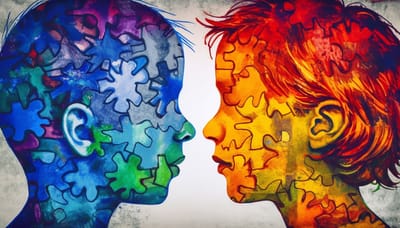
Warm colors (reds, oranges, yellows) energize and stimulate, while cool colors (blues, greens, purples) calm and soothe. Explore the science behind why we perceive colors as warm or cool — from wavelengths and color temperature to psychological effects on mood, arousal, and behavior — plus practical tips for design, branding, and everyday life.
Read More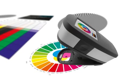
CIELAB provides precise, device-independent color measurement using Lab* coordinates, while LCh (lightness, chroma, and hue) offers an intuitive polar view for easier adjustments. Learn how to use both for accurate color matching in printing, photography, design, textiles, and manufacturing— including ΔE calculations, hue/chroma corrections, and real-world workflows.
Read More
Discover how HDR (High Dynamic Range) and Wide Color Gamut (WCG) are revolutionizing visual experiences. Learn the science behind brighter highlights, deeper shadows, and more vibrant colors with standards like Rec.709 vs. DCI-P3 vs. Rec.2020 and why these technologies make digital content look closer to real life than ever before.
Read More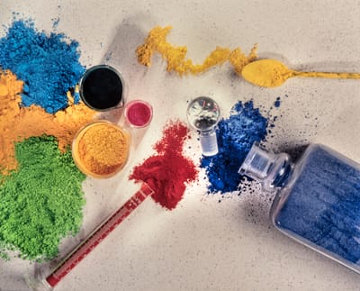
Paints feel opaque and durable, while dyes soak in and create vibrant, translucent colors. The secret lies in their chemistry: pigments are insoluble particles suspended in a binder, while dyes are soluble molecules that chemically bond to materials. Explore solubility, particle size, lightfastness, opacity, and real-world applications in art, textiles, and manufacturing.
Read More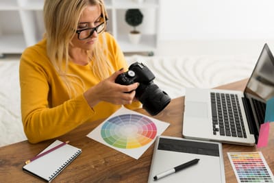
Struggling with colors that look different on screen, print, or online? This practical guide walks you through essential color management techniques—monitor calibration, ICC profiles, working color spaces (sRGB vs. Adobe RGB), soft proofing, and real-world workflows for photographers and designers to achieve consistent, accurate colors every time.
Read More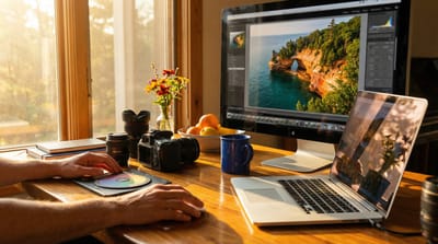
RGB and CIE XYZ tell us the physics of color, but they don’t capture how colors appear under different lighting, backgrounds, or viewing conditions. Enter Color Appearance Models (CAMs) like CIECAM02 and CIECAM16 — the advanced tools that predict brightness, colorfulness, and hue as the human eye actually perceives them. Discover why these models are essential for realistic HDR displays, accurate color management, and making digital images look truly lifelike.
Read More
Ever disagreed with someone about the exact shade of a color? Discover the surprising science behind why two people can look at the same object and genuinely see different colors — from individual differences in cone cells and genetics to the brain’s role in color constancy and the famous #TheDress illusion.
Read More