From Isaac Newton’s groundbreaking prism experiments in the 1660s to the development of CIE color spaces and modern colorimetry, discover how scientists turned the mystery of color into a precise, measurable science that powers today’s displays, printing, photography, and design.
Read MoreColor Theory
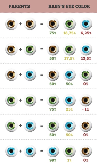
Most people think color blindness means seeing only in black and white. The surprising truth is far more intriguing. Discover the different types of color vision deficiency, why it affects more men than women, how the human eye actually works, and what the world really looks like to someone who is color blind.
Read More
Discover how color science makes vibrant screens and accurate prints possible. Learn about the exciting technology that keeps colors looking the same and accurate on different devices and in print, from how digital screens use additive RGB mixing (like OLED and Quantum Dots) to how printing uses subtractive CMYK, along with the important roles of CIE color spaces and ICC profiles.
Read More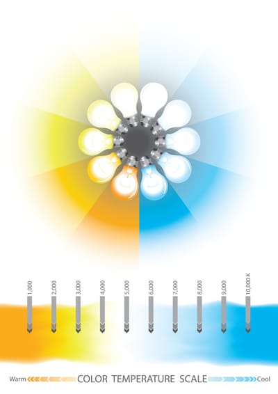
Learn how color temperature (Kelvin) affects the mood of your space and why CRI (Color Rendering Index) determines how accurately colors appear. This practical guide helps you choose the perfect lighting for homes, offices, photography, art, and retail—so colors look natural, vibrant, and true.
Read More
Your phone, TV, and laptop screen can display millions of vibrant colors using just three: red, green, and blue. Discover the fascinating science of additive color mixing, how tiny RGB subpixels work together to trick your eyes, and why this system perfectly matches human vision.
Read More
A practical, system-focused guide to the most common color palette mistakes, with clear fixes, tests, and workflows for better design decisions.
Read More
A deep, practical list of the most common color mixing mistakes artists make, plus clear fixes for cleaner, brighter, more repeatable mixes.
Read More
A practical tip list covering the 25 most common color mixing errors and clear, repeatable fixes for cleaner, more believable color in any medium.
Read More
A detailed tip list of the most common color mixing mistakes and practical fixes for cleaner, more accurate, repeatable color results.
Read More
A practical, in depth list of 15 essential color palette rules for building harmonious, accessible, consistent design systems across digital and print.
Read More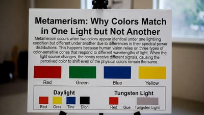
Have you ever matched two colors perfectly in the store, only to see them look completely different at home? That’s metamerism at work. Discover why certain colors that appear identical under one light source can look strikingly different under another, the role of spectral power distributions, and how this phenomenon affects design, printing, photography, and everyday life.
Read More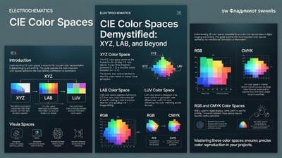
Confused by color spaces like CIE XYZ and CIELAB? Discover how the International Commission on Illumination (CIE) created the first device-independent color systems in 1931, why XYZ became the foundation of modern color science, and how LAB makes color perception more human-friendly. A clear, beginner-to-intermediate guide to the backbone of accurate color reproduction.
Read More