Practical Guide to Color Management in Photography and Design
You spend hours editing a photo until the colors look perfect on your screen. Then you print it—or share it online— and the result looks completely different. Reds turn muddy, blues look dull, and skin tones shift.
This frustrating experience happens because of inconsistent color across devices. Color management solves this problem by ensuring colors look as consistent as possible from camera to screen to print.
This practical guide explains the essentials in simple terms and gives you actionable steps you can apply today, whether you're a photographer, graphic designer, or creative professional.
Why Color Management Matters
Every device sees color differently:
- Your camera captures in its own color space.
- Your monitor displays colors based on its calibration.
- Printers use CMYK inks with a much smaller gamut than your screen.
Without color management, the same image file will look different everywhere. Proper color management creates a predictable workflow so “what you see is what you get” (WYSIWYG).
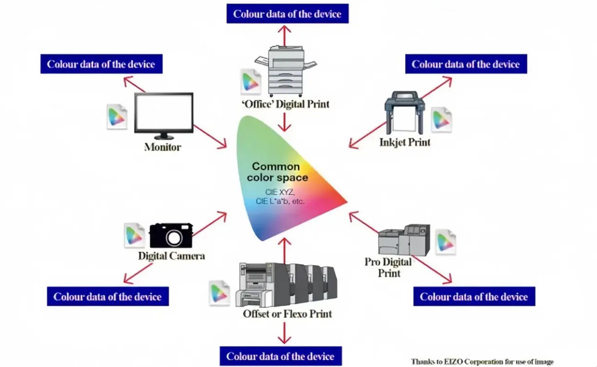
Caption: Color management uses a common color space (like CIE XYZ or Lab*) as a bridge between devices such as cameras, monitors, and printers.
Core Concepts You Need to Know
- Color Spaces
- sRGB — Standard for web and general photography. Safe choice for most online sharing.
- Adobe RGB (1998) — Wider gamut, better for professional printing and editing.
- ProPhoto RGB—an even wider gamut, ideal for high-end photography (use with 16-bit files to avoid banding).
- ICC Profiles These small files describe how a specific device reproduces color. Your monitor, camera, and printer each have (or need) an ICC profile.
- Rendering Intents When converting between color spaces:
- Relative Colorimetric—Good for most photography (preserves white point).
- Perceptual—Best when the source gamut is much larger than the destination (smooth compression).
- Absolute Colorimetric—For proofing exact colors.
- Working Color Space: Set this in Photoshop or Lightroom (Edit > Color Settings). Adobe RGB is a wonderful starting point for most creative work.
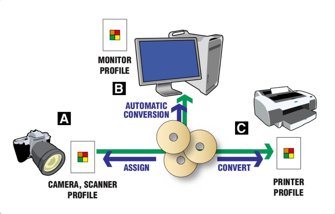
Caption: Simplified color management workflow: Assign or convert using device profiles (camera → working space → monitor/printer).
Step-by-Step Practical Workflow
1. Calibrate Your Monitor
- Use a hardware calibrator (X-Rite i1Display, Datacolor Spyder, or Calibrite).
- Set white point to D65 (6500K), gamma to 2.2, and brightness to 100–120 cd/m² for standard editing.
- Calibrate every 2–4 weeks.
2. Set Up Your Software in Photoshop:
- Edit > Color Settings → Choose “North America Prepress 2” or “Europe Prepress 3” as a starting point.
- Set the RGB workspace to Adobe RGB.
In Lightroom:
- Preferences > External Editing → Set Edit in Photoshop to Adobe RGB or ProPhoto RGB.
3. Handle Files from Camera
- Shoot in RAW whenever possible (RAW files contain more color data and no baked-in profile).
- When opening RAW files, assign the correct camera profile or let the software handle it.
4. Soft Proofing (Preview Before Printing) Soft proofing simulates how your image will look on paper using your monitor.
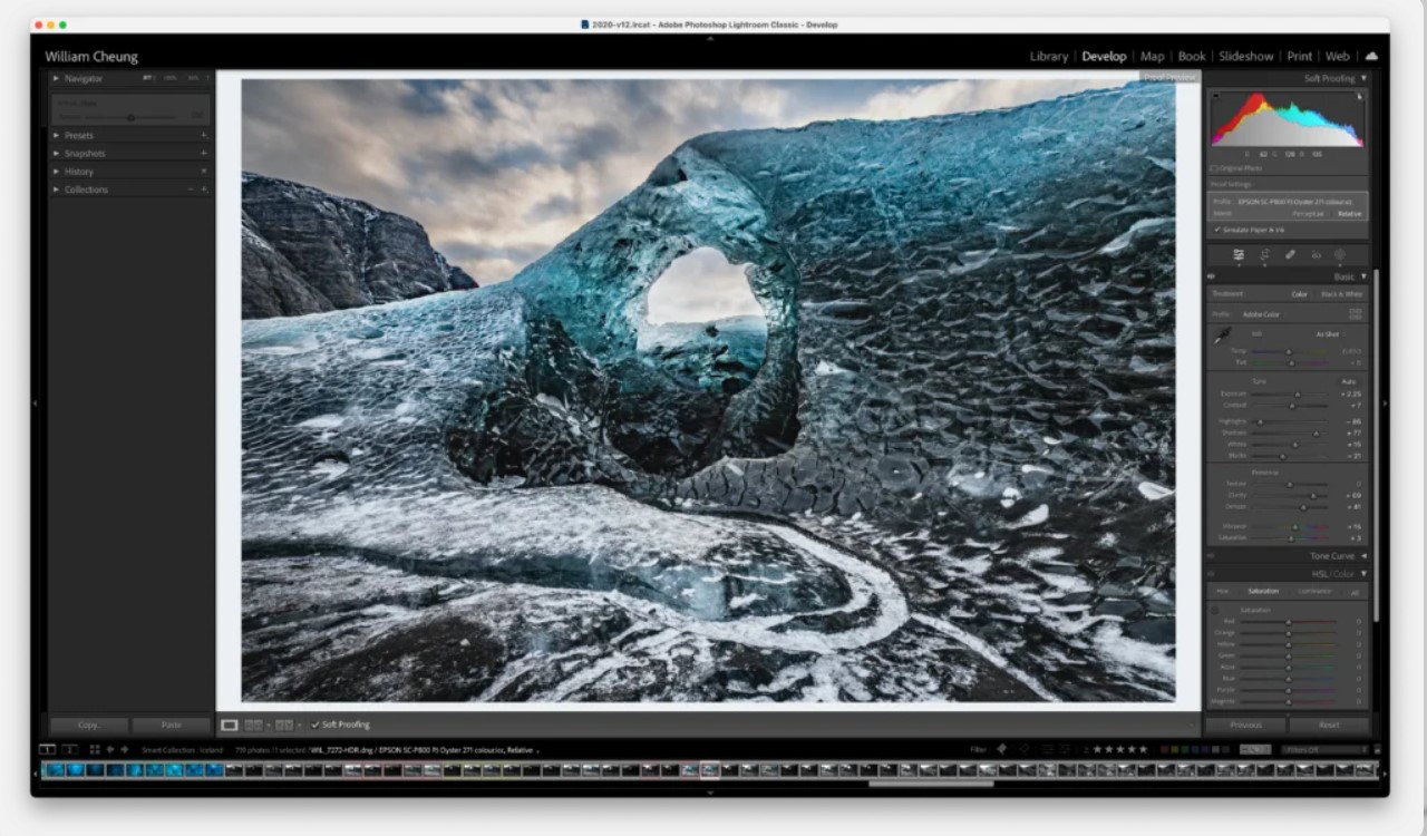
Caption: Soft proofing in Lightroom/Photoshop lets you preview how colors will shift on specific paper and printer combinations.
How to SoftProof in Photoshop:
- Go to View > Proof Setup > Custom, then select your printer and paper profile.
- Enable “Simulate Paper Color” and “Simulate Black Ink” for a realistic preview.
- Adjust your image while soft proofing is on.
5. Prepare for Web vs Print
- For web/social media: Convert to sRGB and embed the profile.
- For print: Keep in Adobe RGB or ProPhoto RGB and let the print lab handle conversion, or provide the correct output profile.
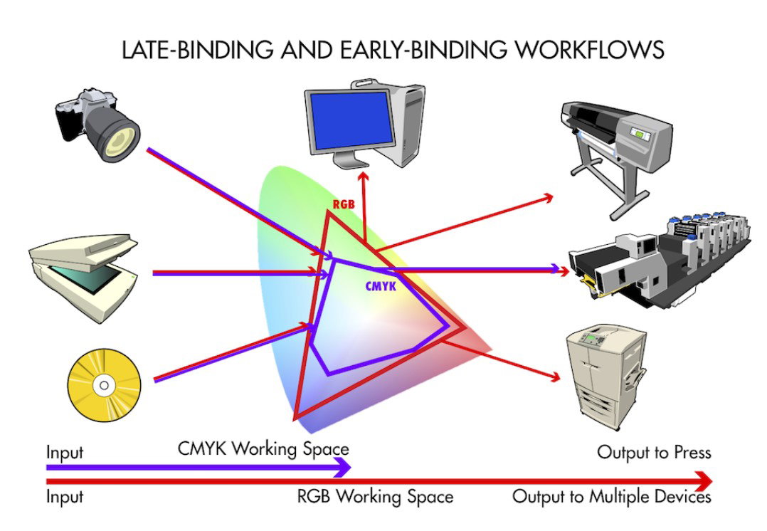
Caption: Early-binding (convert to CMYK early) vs. late-binding (stay in RGB longer) workflows.
Common Mistakes to Avoid
- Working without a calibrated monitor.
- Forgetting to embed the ICC profile when saving files.
- Converting to sRGB too early for print work.
- Ignoring rendering intent when converting color spaces.
- Use 16-bit files instead of 8-bit files for wide-gamut editing.
Quick Checklist for Reliable Results
- Calibrate monitor regularly.
- Shoot in RAW and set a consistent color space in the camera (if using JPEG).
- Use Adobe RGB for editing.
- Embed profiles in all saved files.
- Soft proof before printing.
- For client delivery: Ask their preferred color space (usually sRGB for web).
Final Thoughts
Color management is not complicated once you understand the basics. It’s a system that translates color consistently across devices so your creative vision stays intact from capture to final output.
Start small: calibrate your monitor today and set proper color settings in your main editing software. You’ll immediately notice more predictable and professional results.
Mastering color management is one of the biggest upgrades you can make to your photography or design workflow.